Reinventing Group Collaboration
A communication and collaboration platform designed to streamline communication and improve productivity.
About
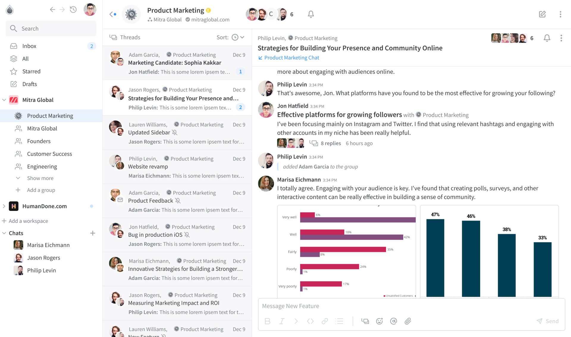
Glue is a better way to chat at work without noise and channel fatigue. You can start chatting immediately or create threads threads with one or more users and groups to keep conversations focused.
One inbox across all of your groups and workspaces gives you a single place to check.
UX/UI
Web/App Design
Landing page Design.
Team Collaboration
Messenger
Design System
App Design
12 Months
Connect Teams in One Place
Glue Groups is a team communication and collaboration hub that connects teams in one place, emphasizing the importance of teamwork, communication, and productivity for all industries and team sizes.
Collaborate better with Glue:
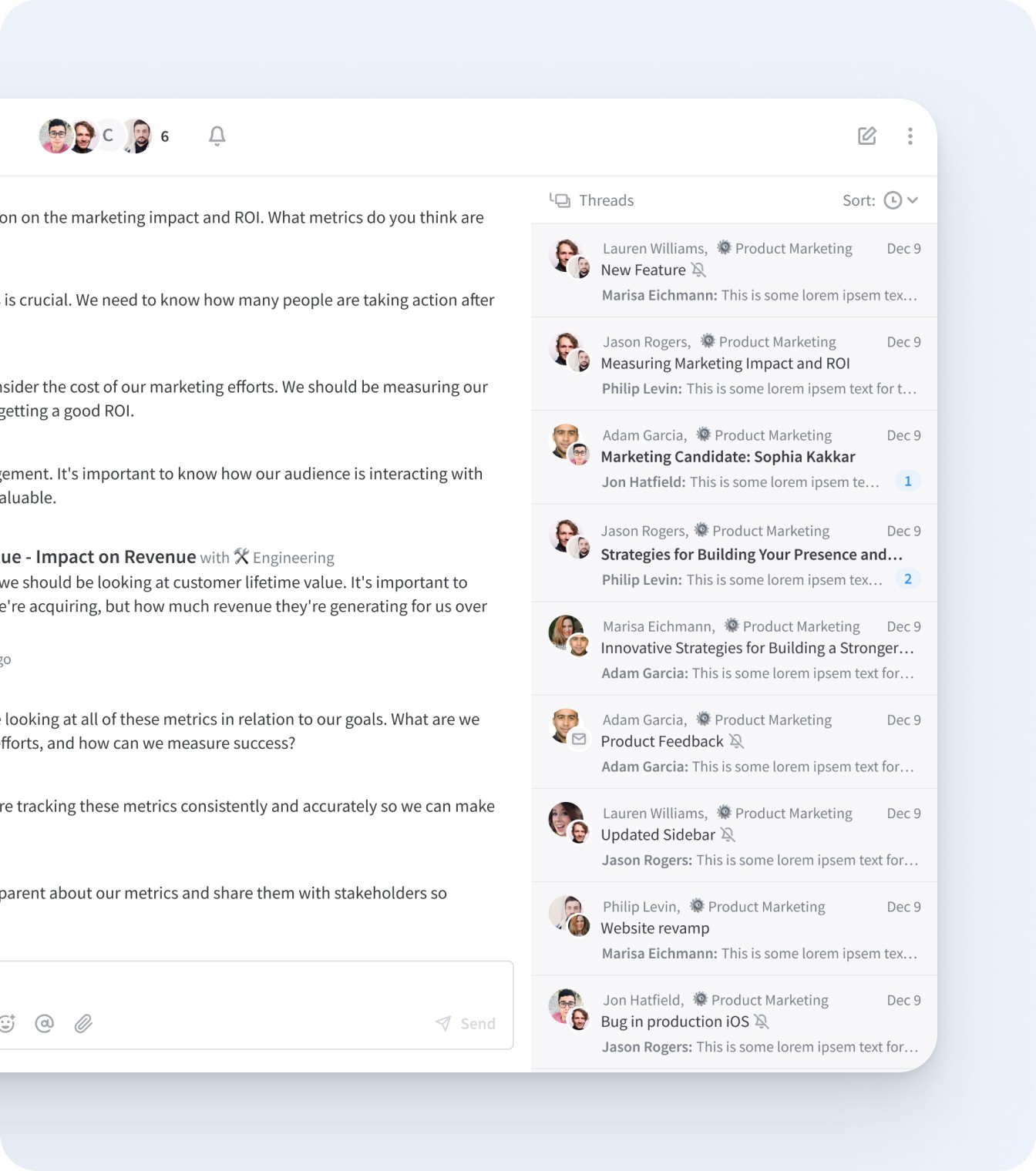
- Focused discussions and task-oriented threads
- Organized conversations with quick access to relevant information
- Reduced chat noise by separating unrelated conversations
The Main Challenge
At the beginning of the project, our primary objective was to enrich the user experience by enhancing the app’s design. After analyzing the current design, we identified several areas that required improvement. We discovered that the user flow lacked intuitiveness, and the interface suffered from inconsistency and a lack of clarity.

The Great Solution
To figure out the best approach here, we ran in-depth research that helped us make informed design decisions, map out key project goals, define users' needs, and add features that would provide them with a robust tool to manage the work process.
Initial Research
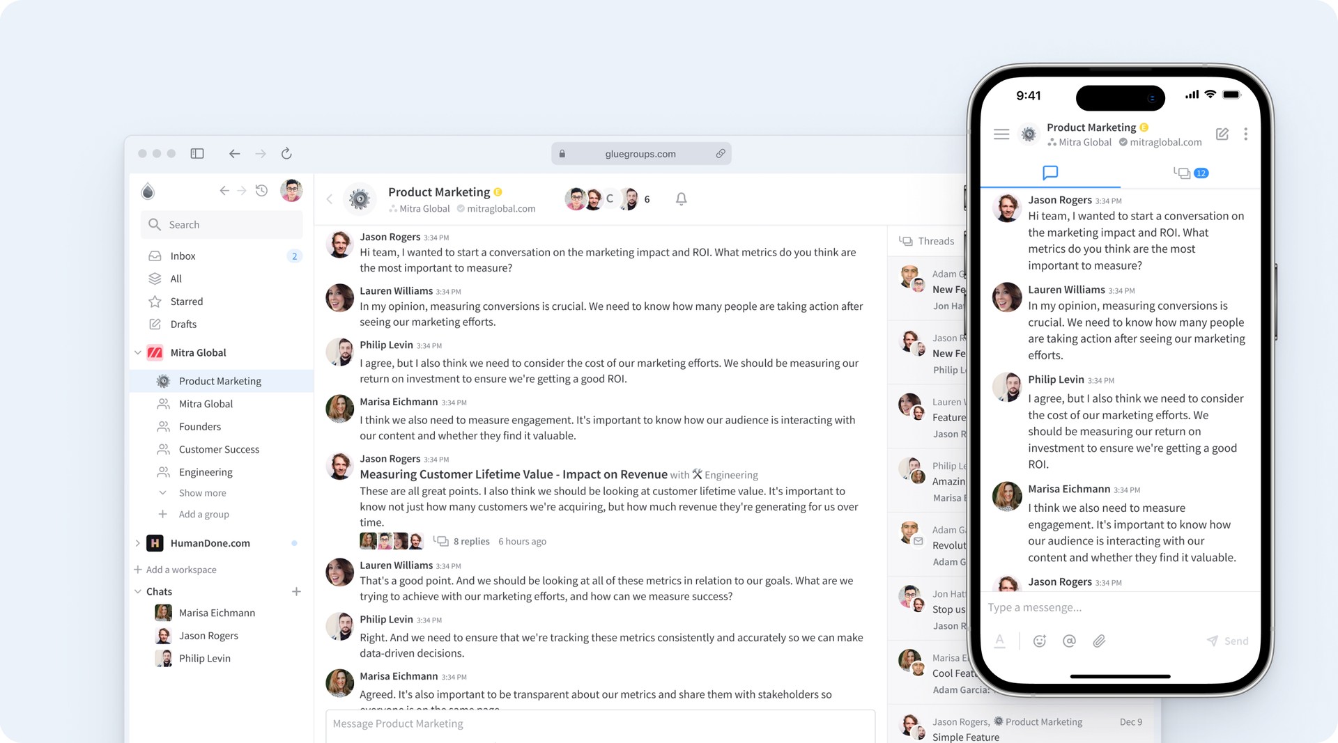
After evaluating client’s current design system and analyzing its shortcomings, we have identified several areas that needs to be improved:
“We need you to review our Design System and reinvent it.”
Design System creative process
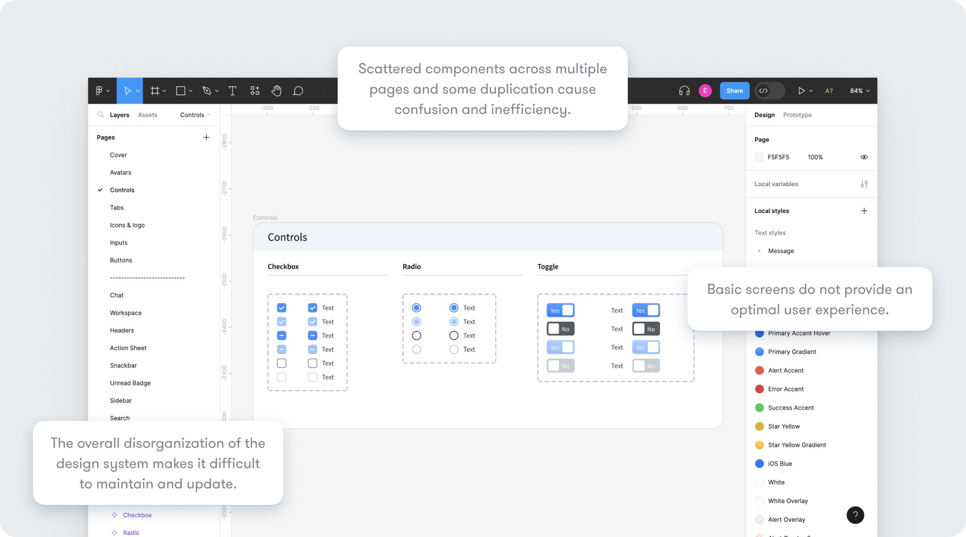
We have organized a component library. It involves grouping all the components of a design system into logical categories or sections based on their purpose, functionality, or visual style. This helps designers and developers find the right components quickly and easily and ensures consistency and coherence.
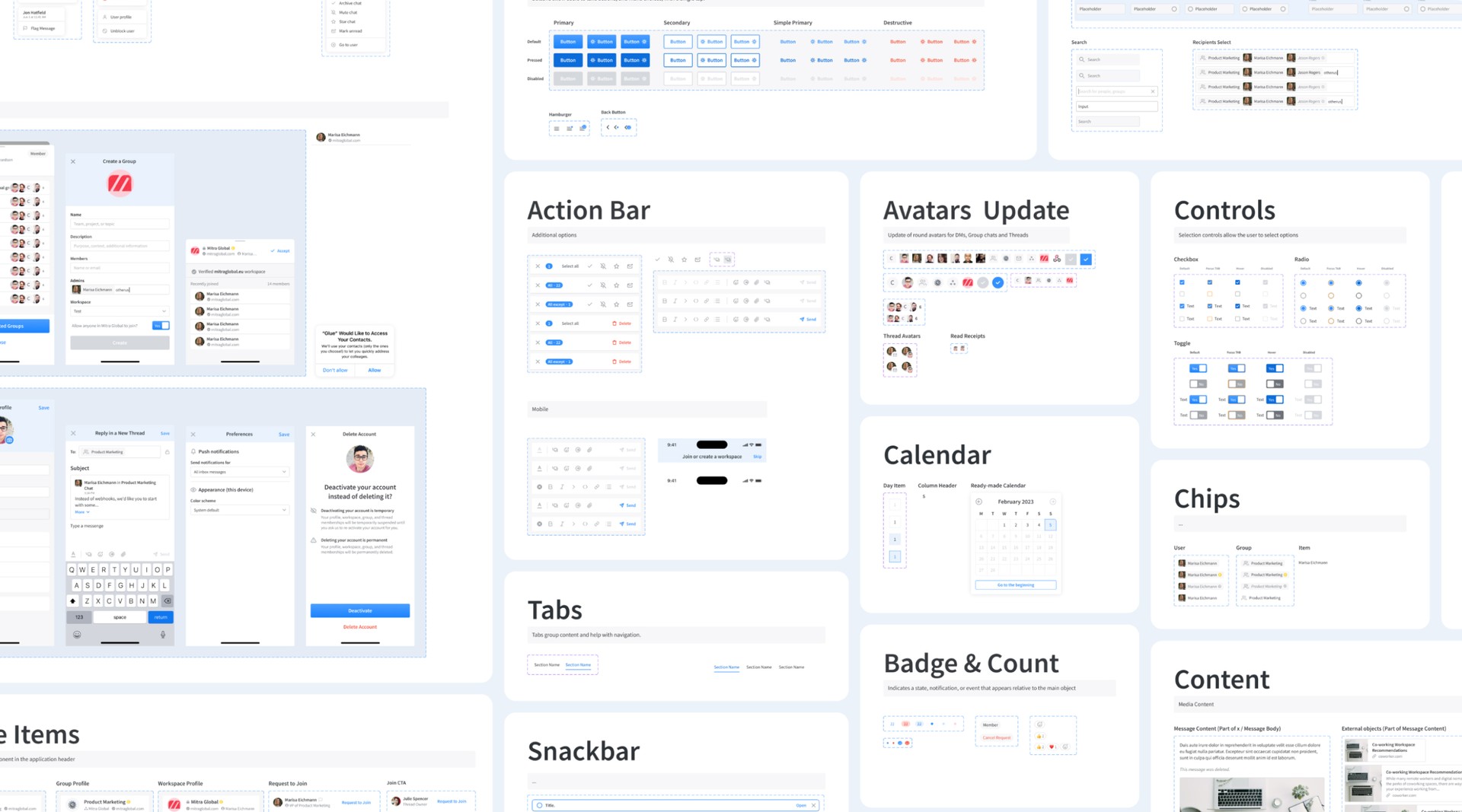
Scalability and Adaptability are two key factors
The design library created as part of the project allows for scalability and adaptability, making it easy to add new features, update the user interface, and accommodate future enhancements to the app.
User Flow Design
By consolidating all flow-related work into a single file, we were able to quickly and easily make revisions as needed. This approach allowed us to rapidly iterate on different versions of our user flows and put them into action with minimal delay.
In some cases, after conducting tests and receiving feedback from users, we have opted to switch to a different version of the user flow that was already in draft. Thanks to our efficient workflow, this process was smooth and seamless, allowing us to make updates quickly and get back to delivering a top-notch user experience.
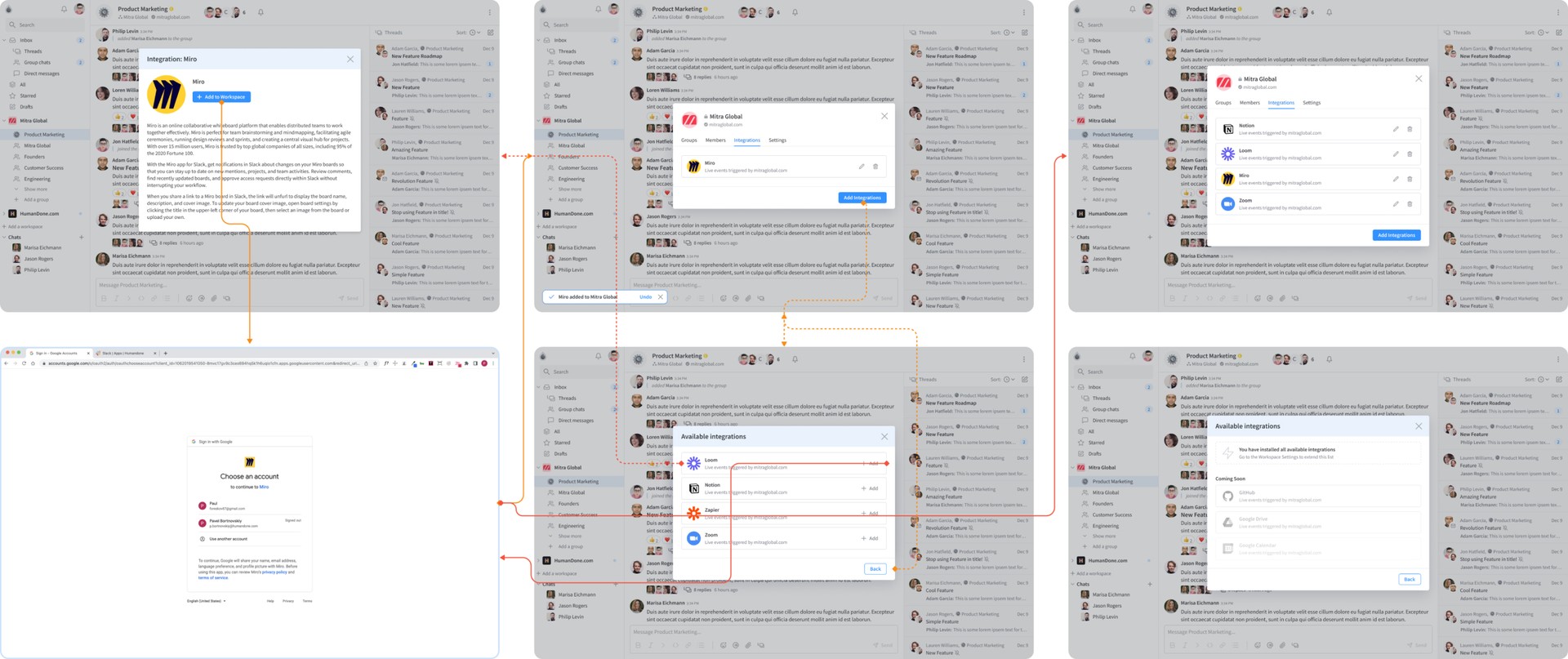
Step 1: Ideation
The first step in the ideation process involved conducting brainstorming sessions where the team shared their individual ideas and concepts.
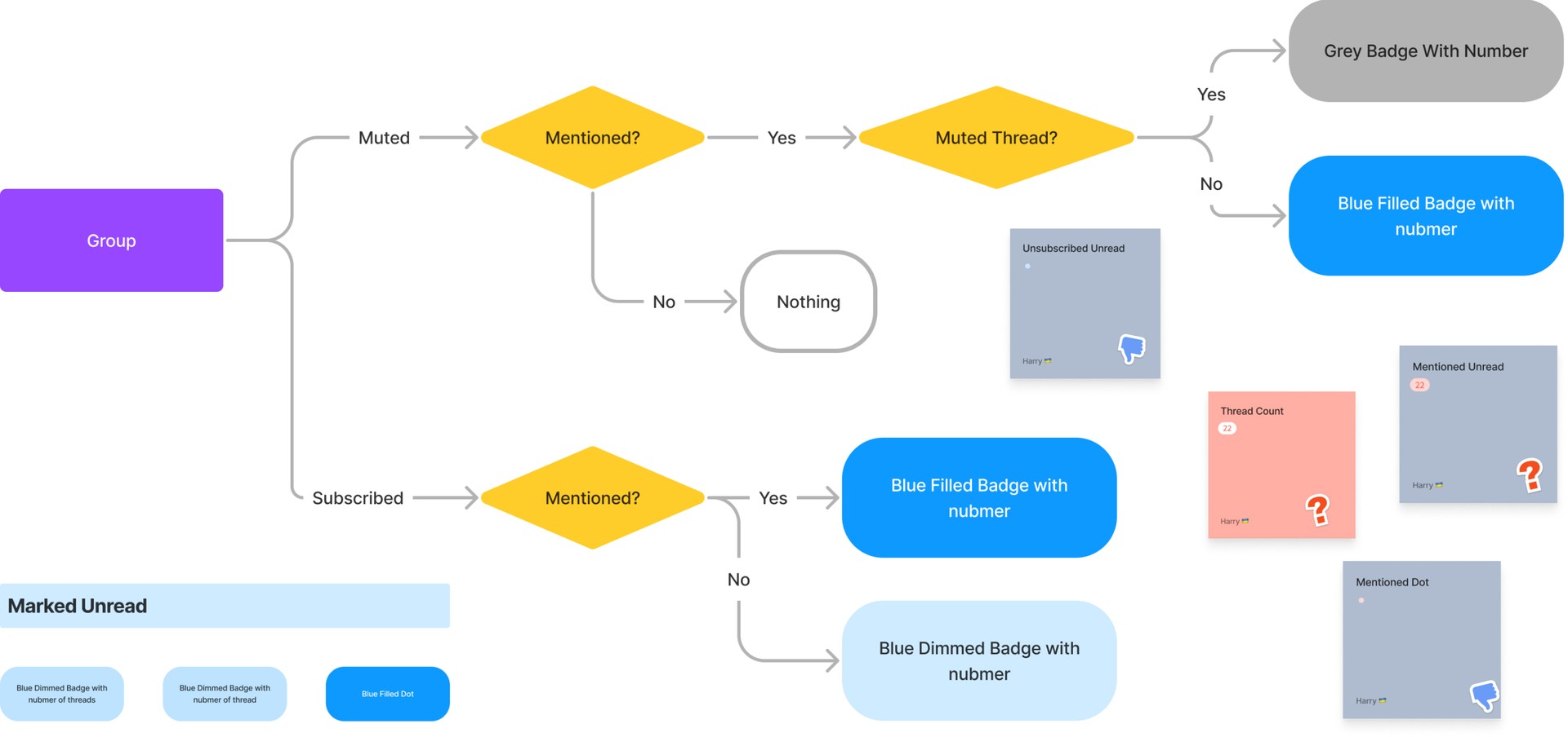
Step 2: Prototyping
Initially, we began with high-fidelity wireframes because we had a pre-established design system. This allowed us to swiftly transfer our ideas to the final design. The high-fidelity prototypes were utilized to evaluate the visual design and interactions of the application. These prototypes created a more realistic representation of the application's design, enabling the team to test how users interacted with the application's interface.
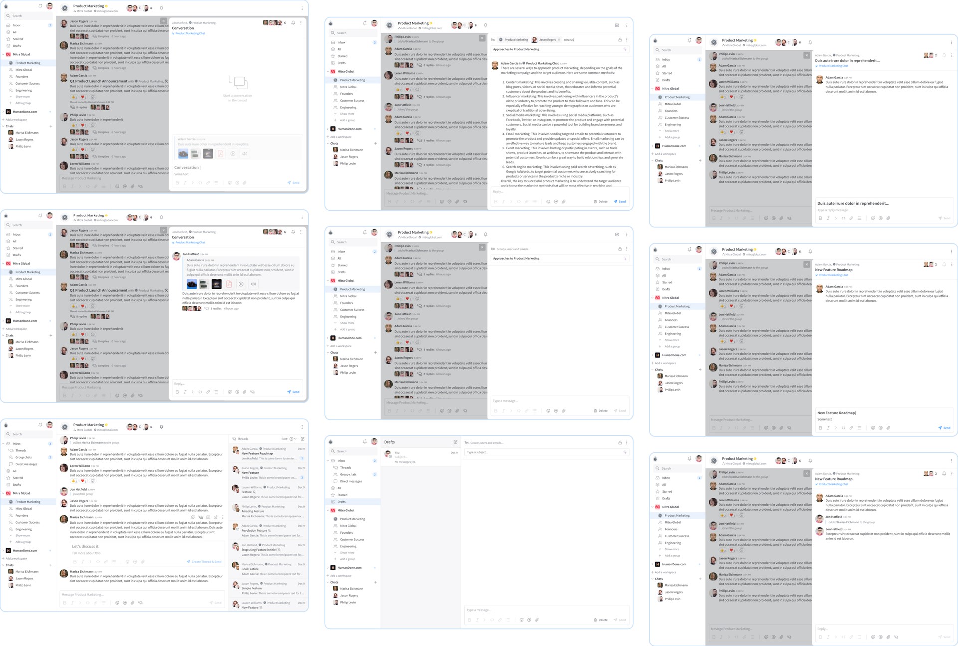
We started with high-fi wireframes because, in the beginning, we had a ready-made design system. It allows us to transfer ideas to the final design quickly.
High-fidelity prototypes are used to test the visual design and interactions of the app. These prototypes provided a more realistic representation of the application's design, and allowed the team to test how users interacted with the application's interface.
Step 3: Iteration
In the process of developing the Glue app, our team hit a major snag with the navigation system. Users were getting lost and couldn't figure out where they were in the app. So, we got to work trying to fix it.
First up, we tried adding breadcrumb navigation, thinking it would help users track their steps. But, when we tested it out, it just didn't cut it. Users were still confused. So, we huddled up, threw around a bunch of ideas, and after a lot of back-and-forth, we hit upon something that felt right: using good old history, back, and forward buttons.
Turns out, this was way easier for users to get the hang of. They could move around the app more naturally, kind of like flipping through pages in a book. We knew we'd struck gold with this approach, and that's what we ended up using in the final version of the app. It made a world of difference.
Final design
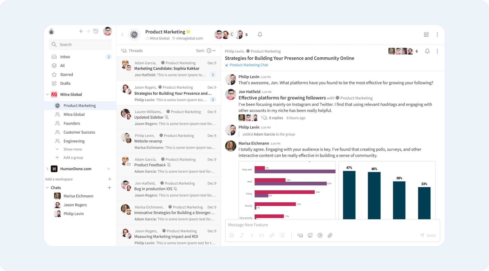
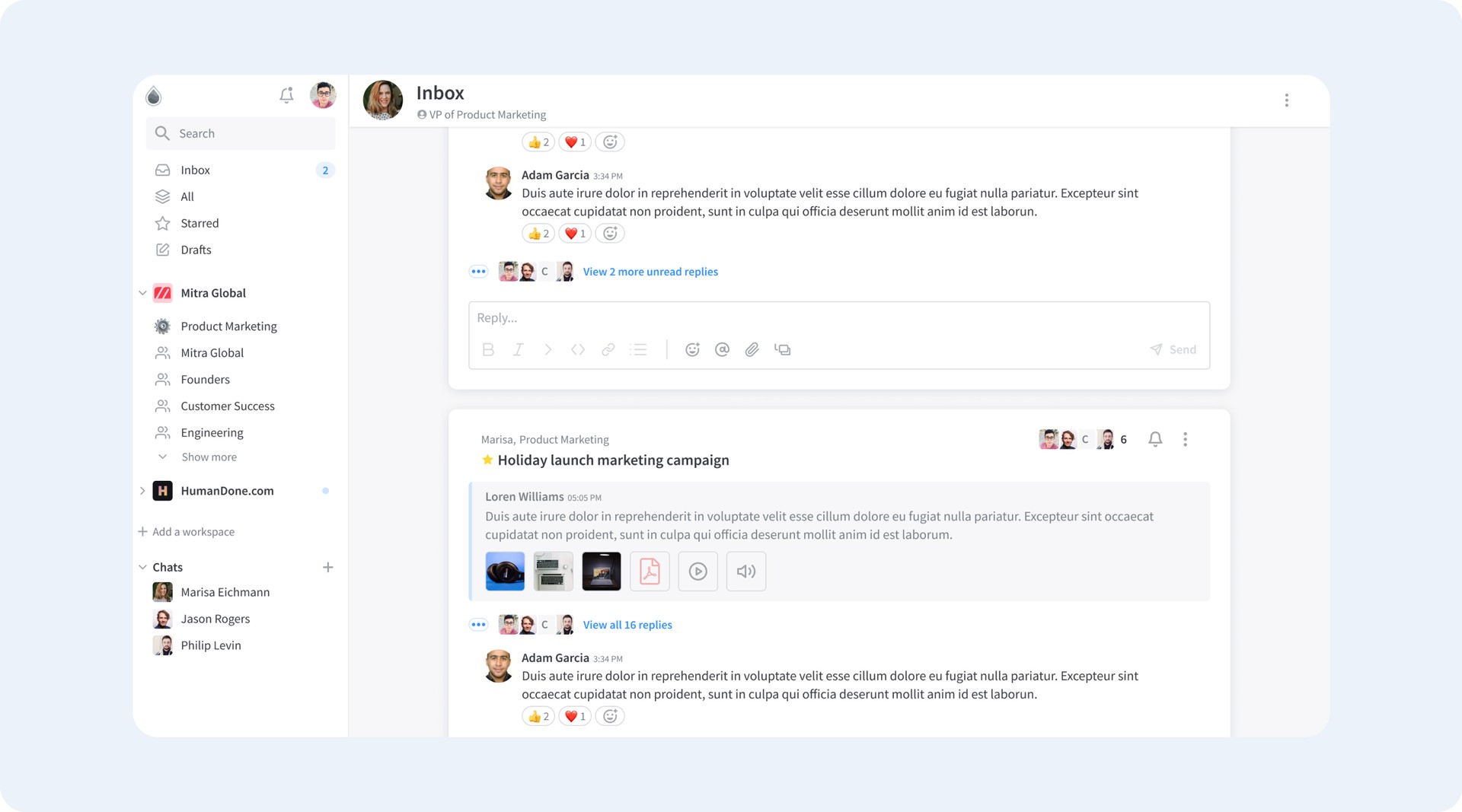
Simplify Task Management with Glue's Thread Tool
Threads in Glue are some kind of tool for task assignment and tracking.
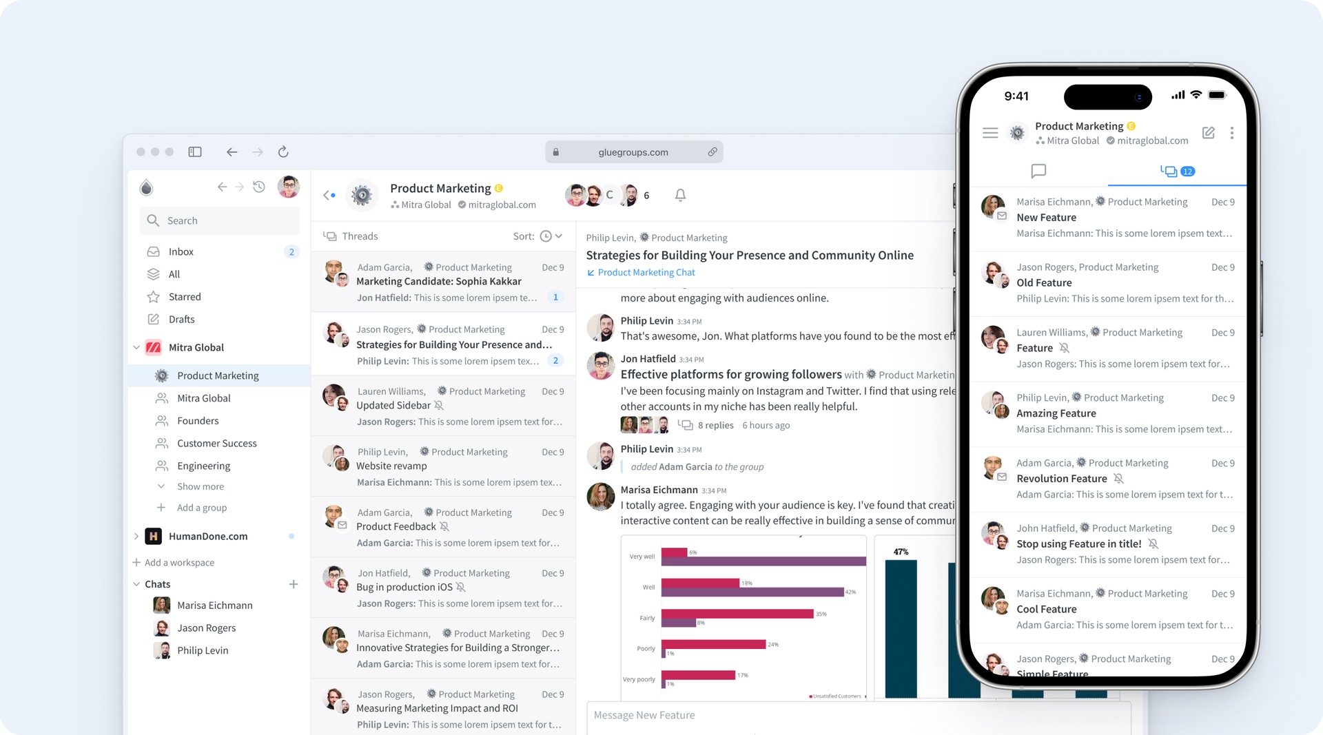
Seamless Cross-Device Experience
We have unified all elements as much as possible for an intuitive experience across all devices, whether it's web, desktop, or mobile. We've optimized our design to ensure easy navigation and consistent functionality, so you can stay up-to-date, work efficiently and effectively from anywhere, at any time.
Quick Sign In
The Sign In flow in Glue is designed to be simple and user-friendly. To improve security, Glue also offers a sign-in method that requires users to enter a code sent to their email or phone number to access their account.
Branding
Logotype
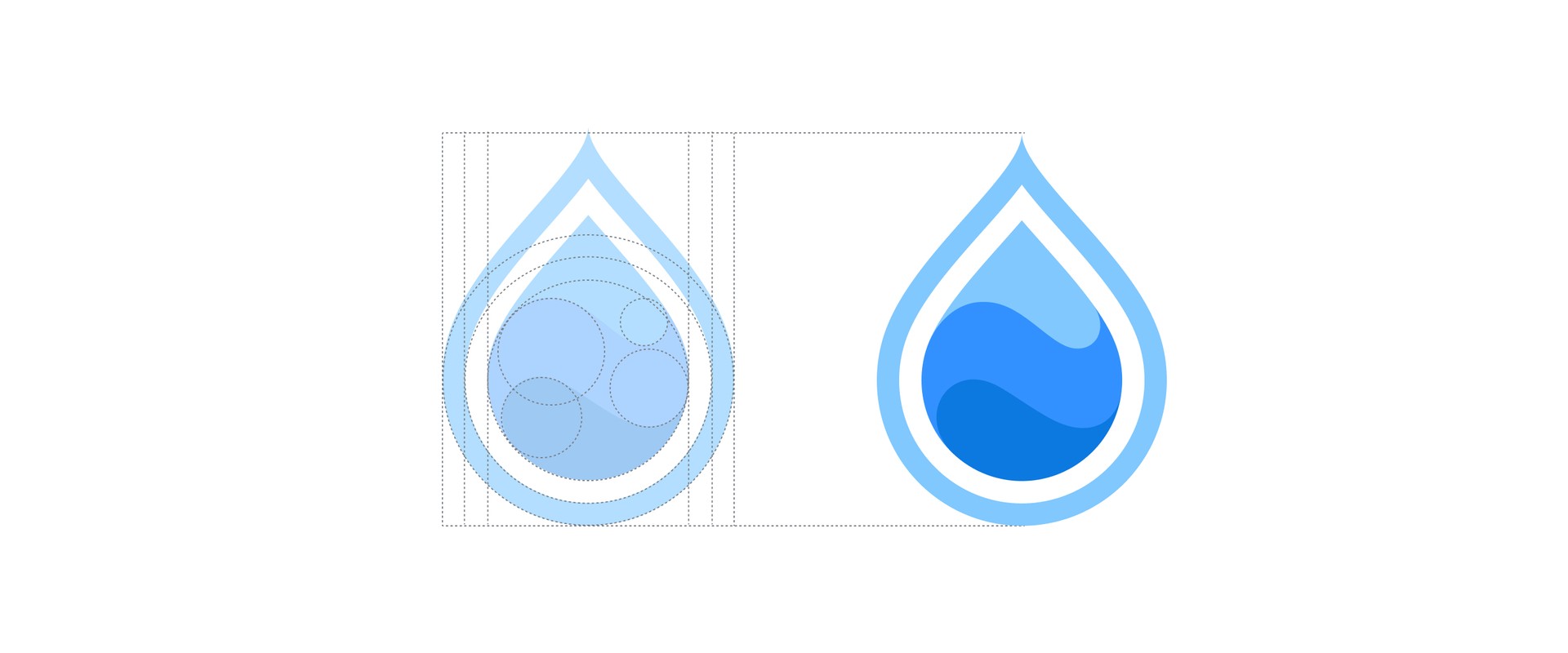
The Glue logo is designed to be dynamic and versatile, with a simple yet memorable symbol that represents the company's focus on connection and collaboration. The font choice is modern and sleek, adding to the overall sense of sophistication and innovation. The use of a vibrant blue color adds to the sense of energy and forward-thinking.

Typography and Colors
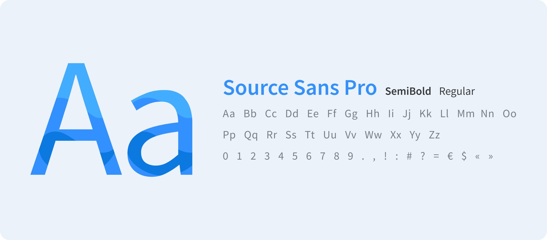
In Glue, typography is an essential part of the brand identity and user interface design. The designers selected a modern, sans-serif font that is highly legible and provides a clean and sophisticated look.
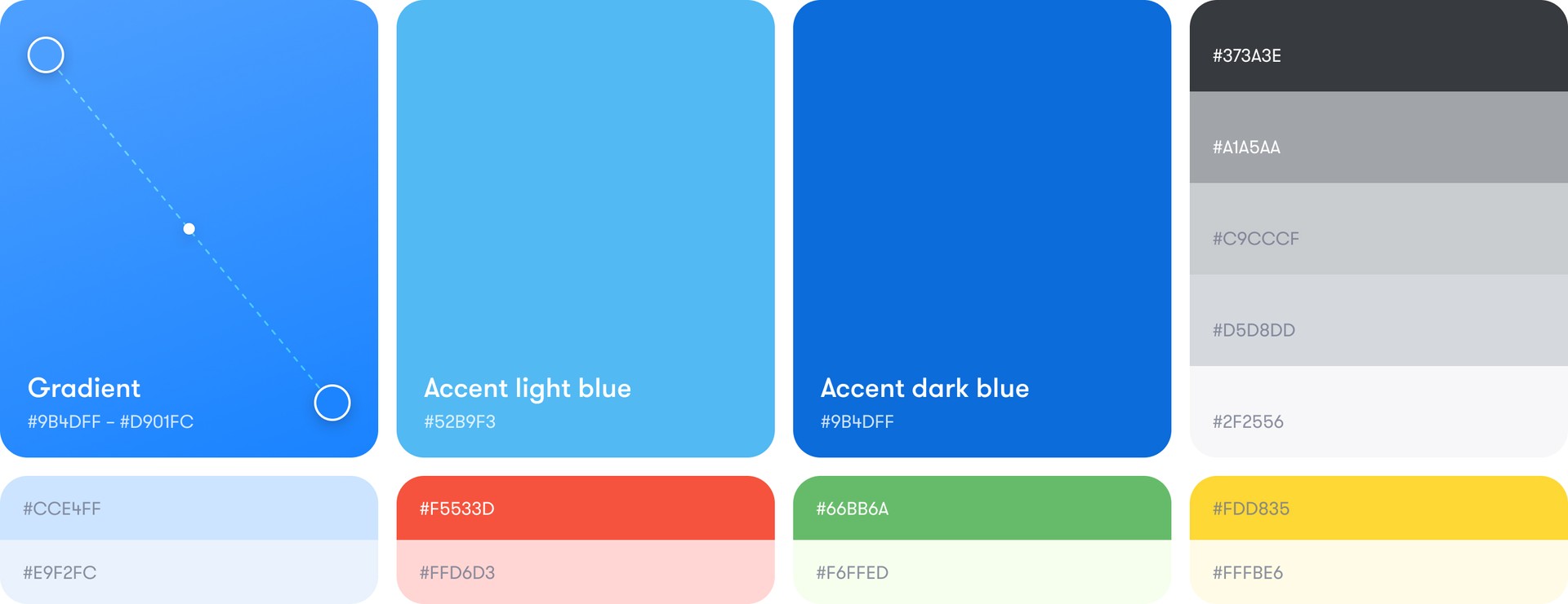
Glue's color palette consists of several shades of blue, grey, and white. The primary blue color is used for the majority of the application's branding and user interface elements. Vibrant blue color conveys a sense of professionalism and trustworthiness, making it instantly recognizable and memorable.
Illustrations

