Revolutionizing Finance with Kamino 2.0
Diversifying DeFi: A Suite of Solana-Based Financial Solutions for Enhanced Liquidity and Strategic Investment.
About
Kamino is an automated liquidity solution, built on DEXs operating concentrated liquidity market makers (CLMMs).
We collaborated with Kamino since 2021 and now the time has come for complete re-building with lots of new features introduced.
UX/UI
Web/App Design
Landing page Design
Design System
React
Web3 Development
Crypto
DeFi
Solana
Web App.
Design System
React Web App
Landing Page
Animations.
5 Months
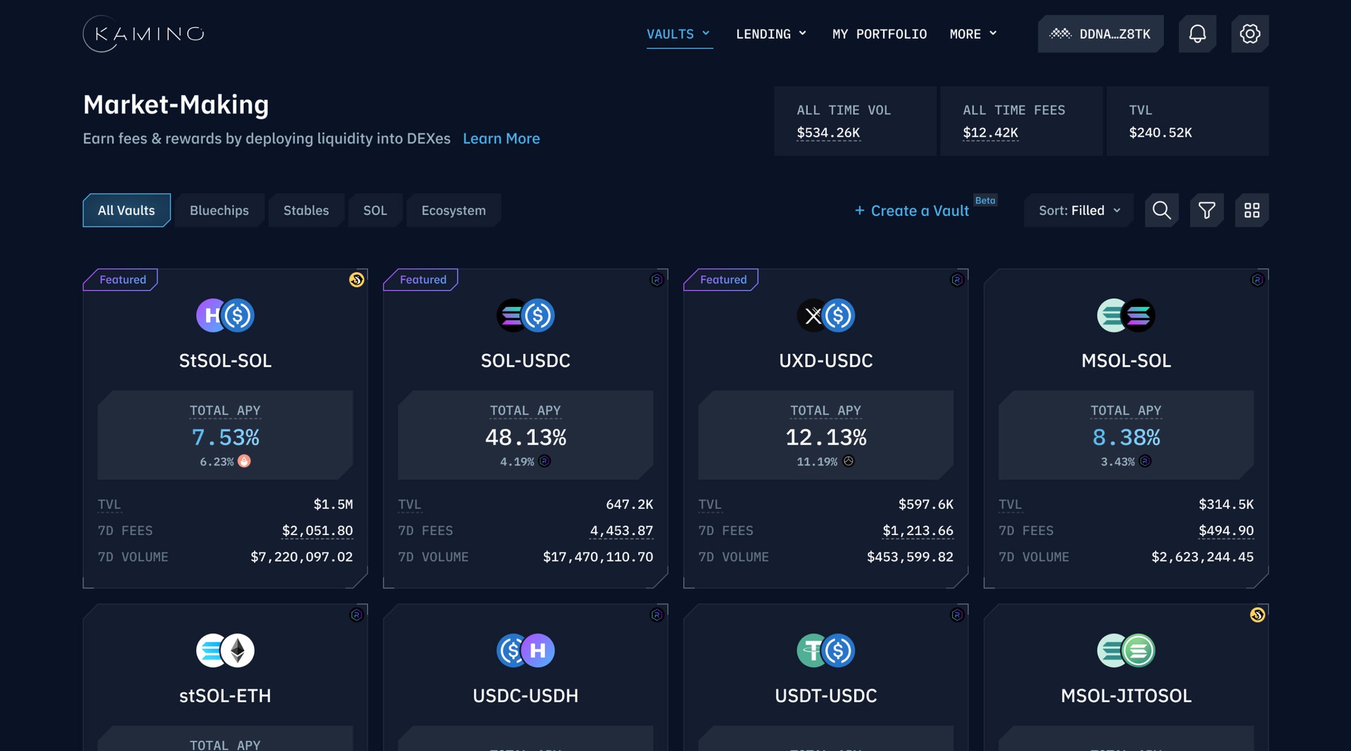
Old Good Kamino
We started working with Kamino in 2021. As the platform evolved, it faced scalability challenges due to features expanding.Then we undertook a strategic redesign transforming Kamino into more adaptable and scalable Solana-based DeFi platform.
The Evolution
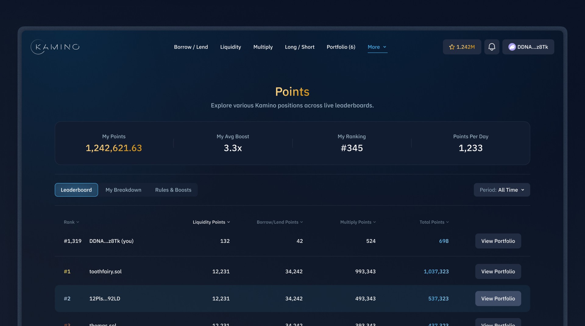
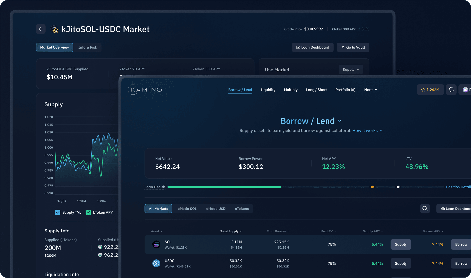
We revitalized Kamino's design, guided by our unwavering dedication to scalability, consistency, and simplicity. Our redesigned app simplifies the user experience, seamlessly accommodating a diverse array of services. With a minimalist philosophy, we crafted a design that's intuitive and visually appealing, setting a new standard for accessible DeFi platforms.
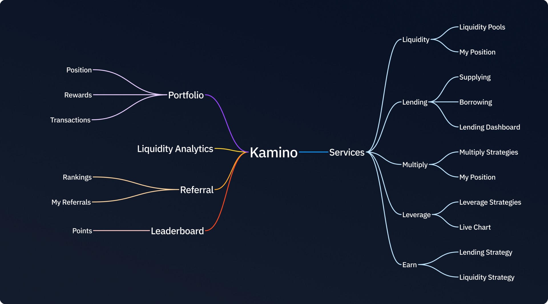
The Beginning
Our initial step was to identify the services Kamino would offer. This was key in designing a flexible structure that would effortlessly adapt to each service with minimal adjustments, laying the foundation for an adaptable and user-friendly application.
Lay Things Out
Having identified the services for Kamino, we then focused on structuring the app. By reviewing each service, we determined the minimal number of layouts needed to suit them all efficiently, with the least amount of modifications. This approach streamlined our design process, ensuring a cohesive and user-friendly interface across various functionalities.
A Complexity to be Simplified
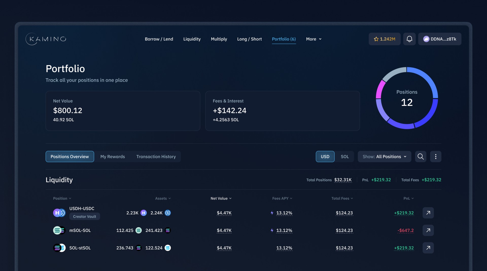
Navigation complexity was one of the main problems of Kamino 1.0, which this redesign aimed to simplify. With a complete map of the app, we conducted extensive research, including competitive analysis, card-sorting tests, and user testing. These efforts led us to discover the optimal navigation structure, significantly enhancing user experience and accessibility.
We've revamped the navigation to make things simpler: top products are now front and center on the navigation bar, while others are neatly tucked under "More." Plus, we've added quick descriptions to each menu item, so newcomers can get the gist of each product at a glance. It's all about making your experience smoother and easier to navigate.
Navigating Strategies
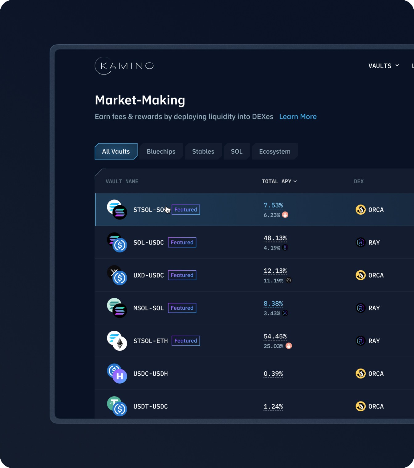
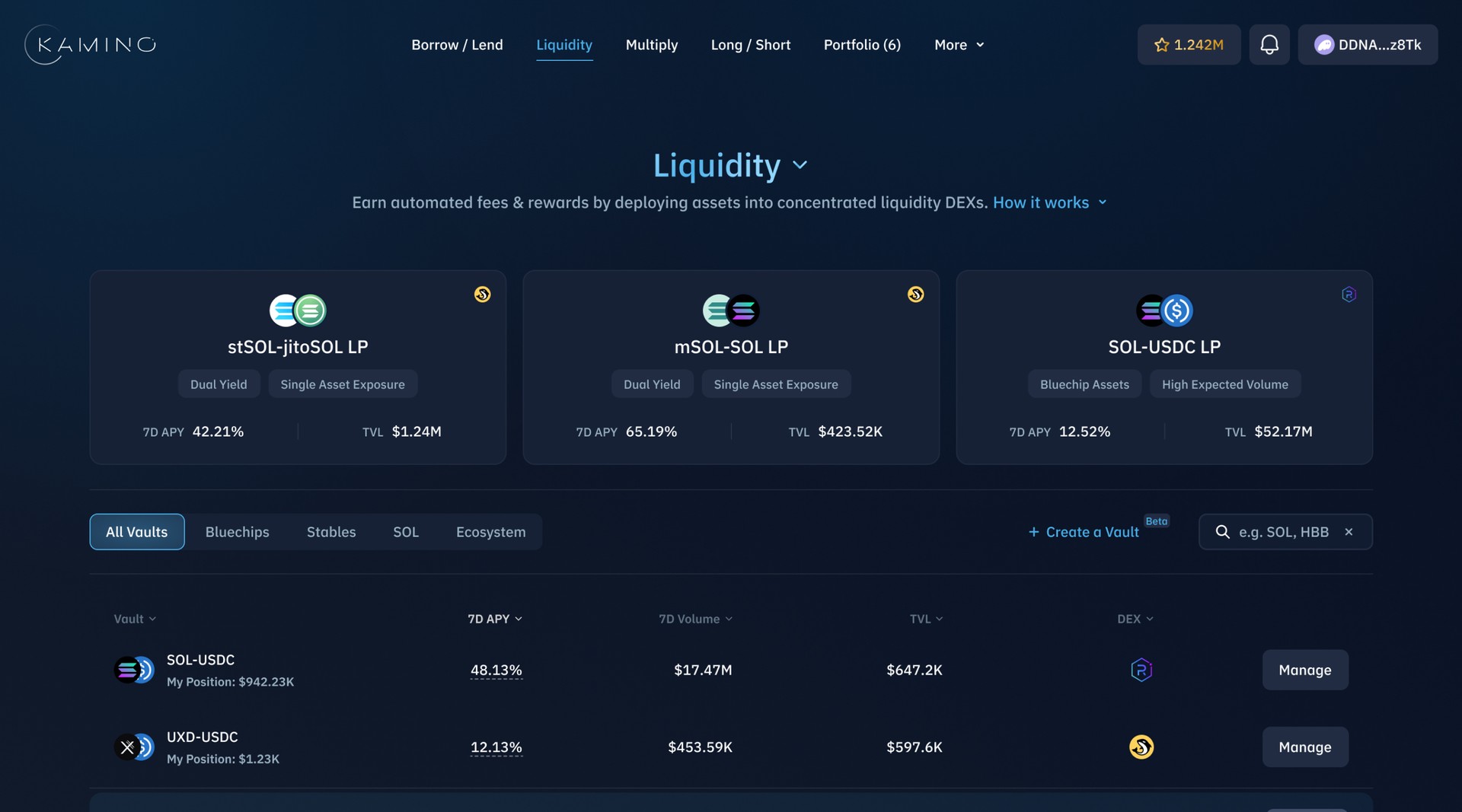
Kamino 1.0 displayed strategies on cards emphasizing big APYs, but this approach had some limitations. Different strategies needed different data fields, and comparing other metrics like TVL or Volume was tough. The new design uses tables for better metric comparison and features distinct cards for the top-3 vaults. This balances detail and ease of use.
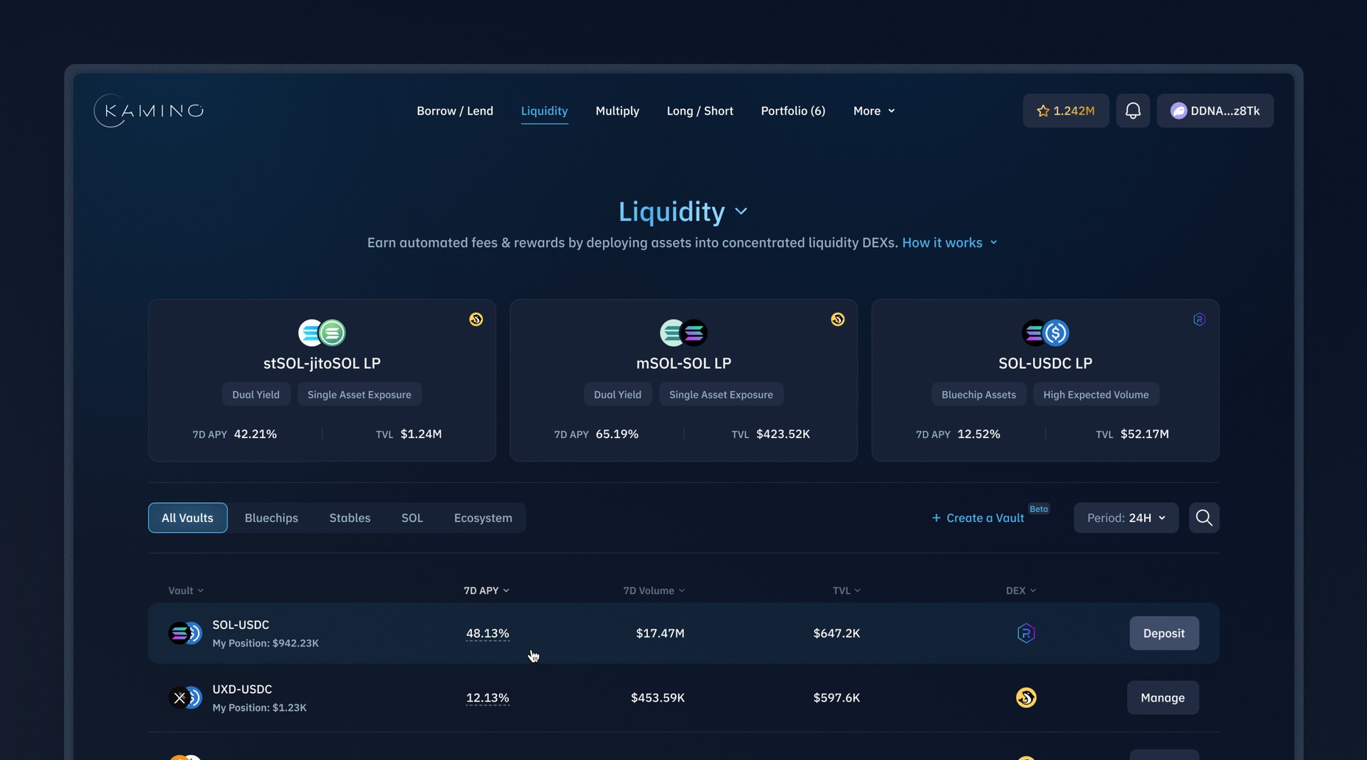
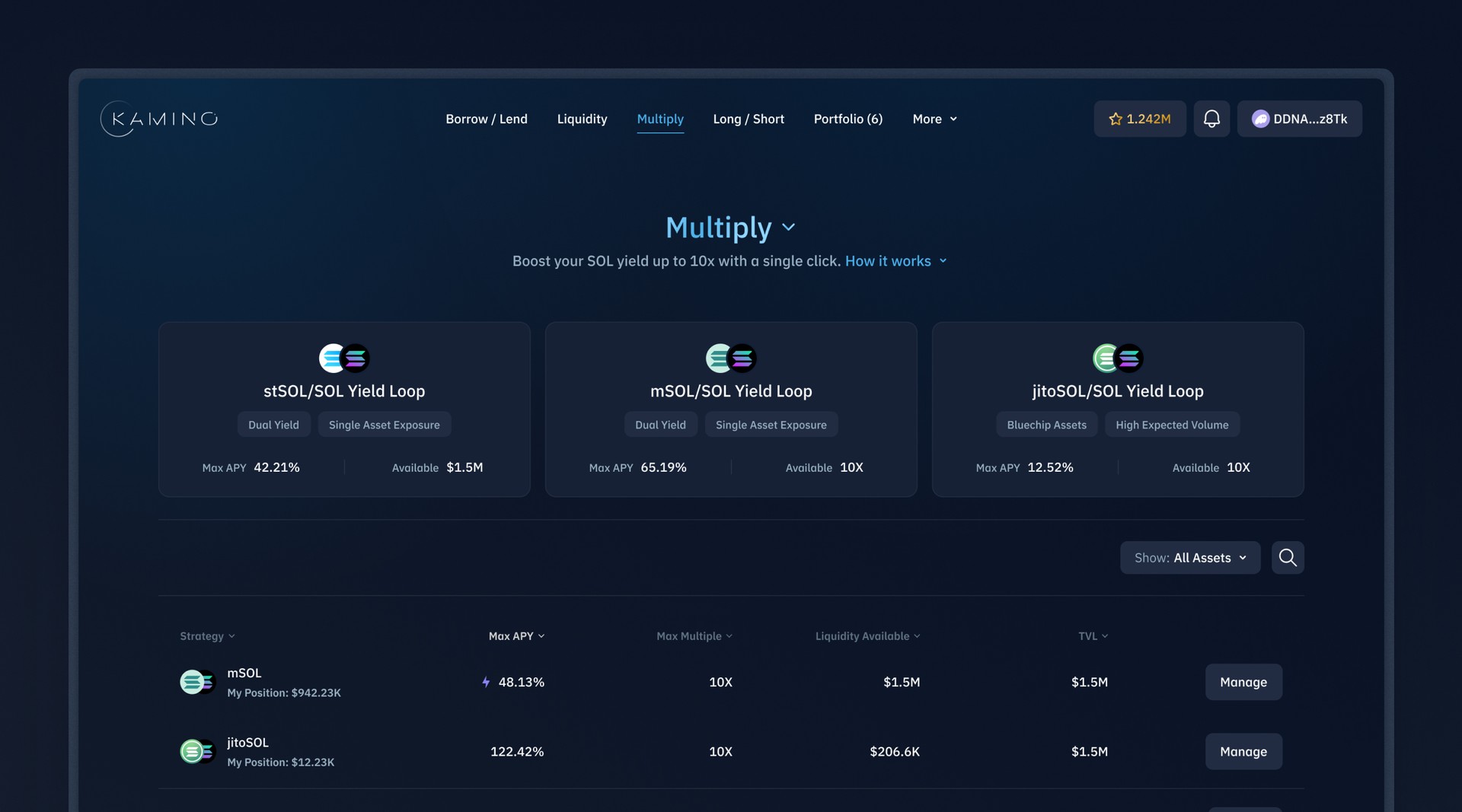
Inside Space
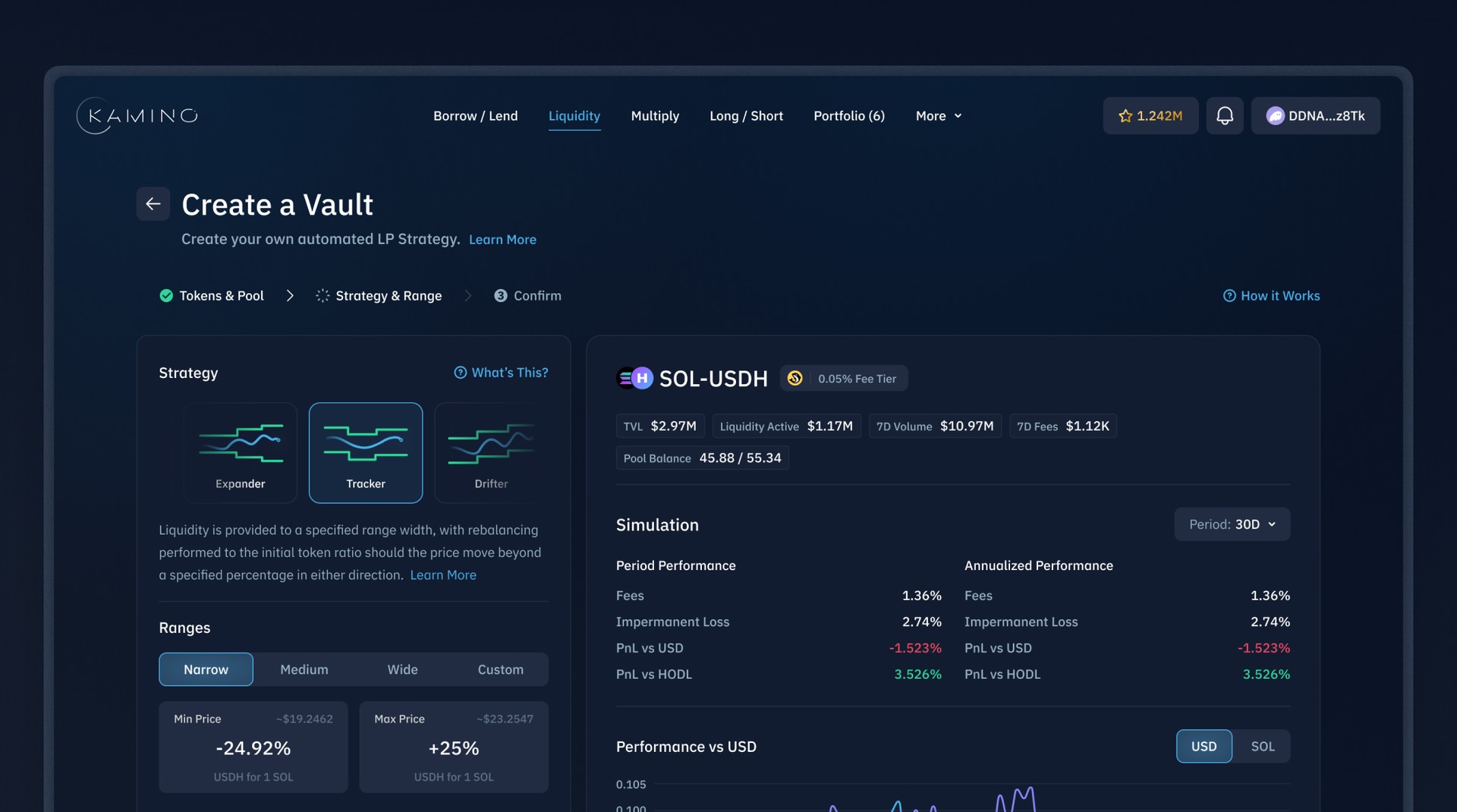
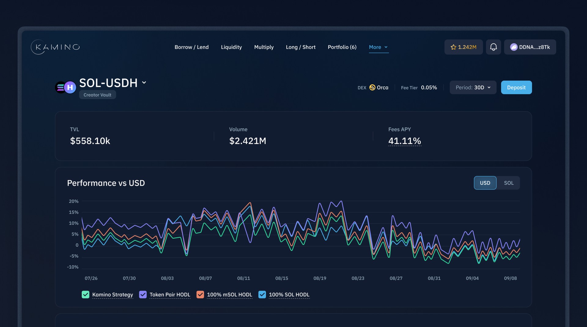
On Kamino, when users explore an earn strategy, they find a strategy page with three sections: Overview, My Position, and Info Page. These sections give key details for investment decisions. Though layouts vary per strategy, the design is uniform with informative content on the left and actionable items on the right, making it easy for users to assess their investment choices.
Unique vs Standard
It's all about striking the right balance between a familiar layout and those unique touches. Keeping a consistent design helps users navigate easily, but it's the special features that really make each experience stand out. It's like having a solid foundation with room for personal flair - that's what brings the whole interface to life and keeps things interesting for everyone.
Mobile Version
Recognizing that 54% of Kamino users access the platform via mobile devices, prioritizing an exceptional mobile experience was essential. We dedicated substantial effort to defining and optimizing the mobile layout, ensuring it was not only functional but also user-friendly.
Landing Page
The landing page is the initial contact with customers, where first impressions matter most. We've designed it to be impactful, clear, and engaging, to grab and keep users' attention. Here it is.
Design System
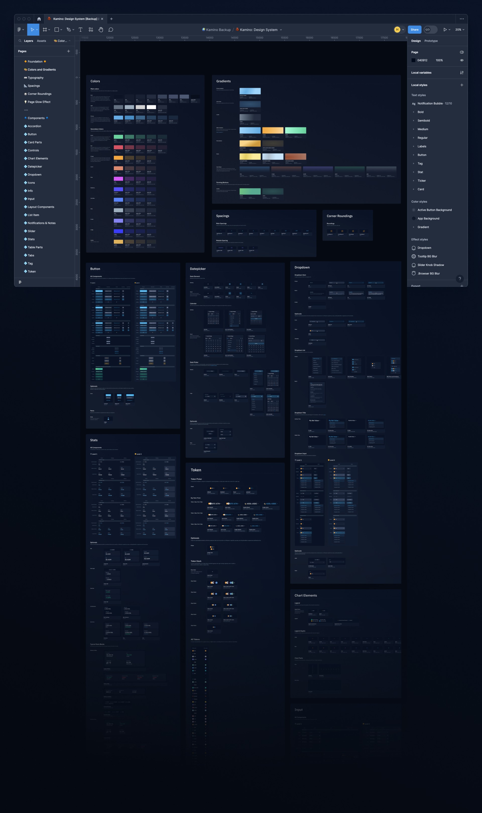
However, all this design work would be for nothing if we didn't have everything well-organized. That's where our design system steps in, making sure everything fits together just right.
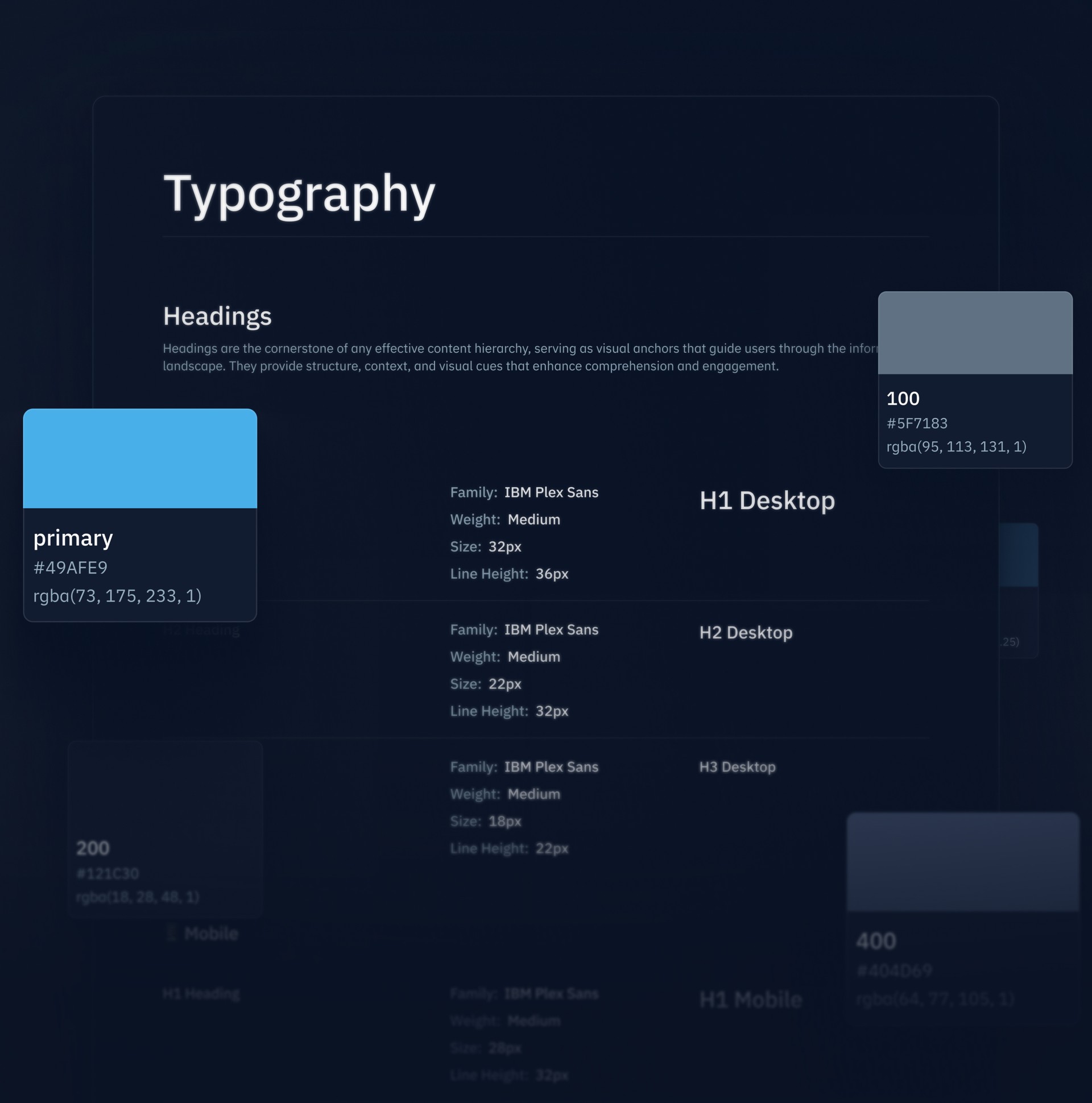
Scalability and Building Blocks
Indeed, a key goal for Kamino 2.0 was scalability, and versatility is its best ally. Our task was to create a wide range of reusable components that don't compromise content or introduce limitations. These components will act as foundational building blocks, enabling us to rapidly develop new modules by merely swapping content and making minor adjustments, thereby facilitating swift and efficient expansion.
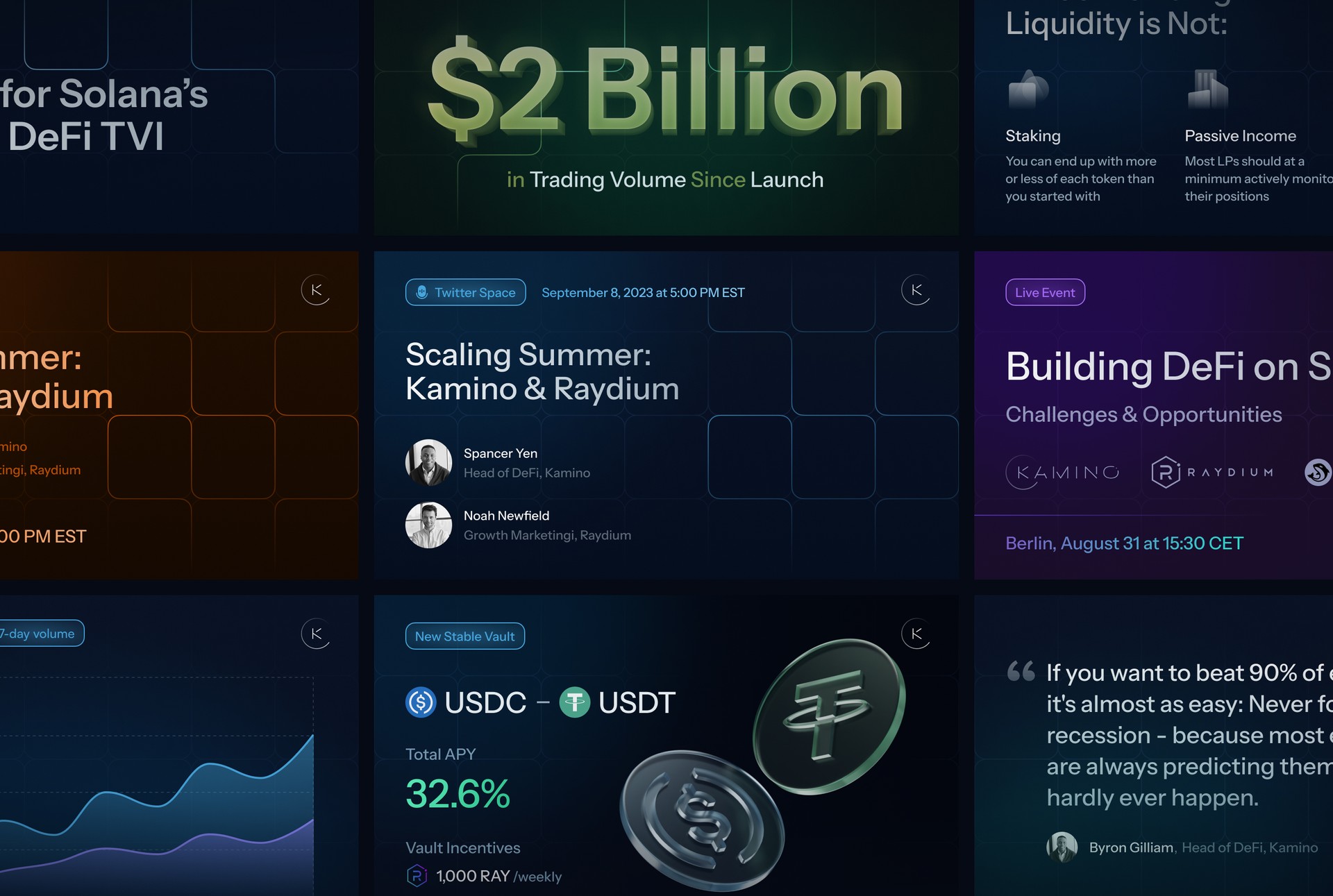
Social Networks Branding
To capture attention on social media, where new clients often emerge, it's essential to have branding that resonates instantly. We focus on creating visually striking branding that captures the user's interest at first glance, ensuring that every interaction starts with engagement.
Illustrations
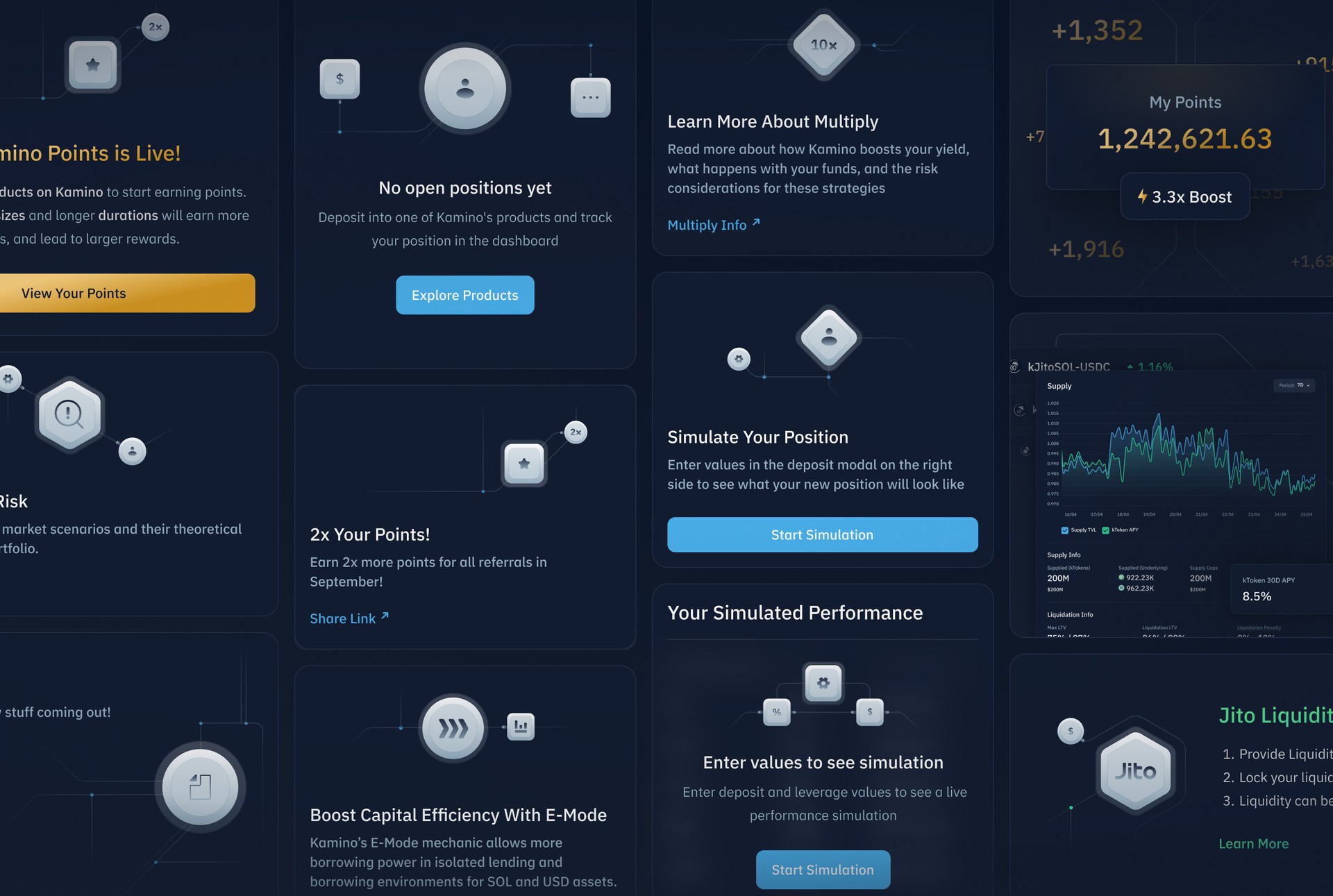
A couple more custom-made illustrations to better highlight the new identity of Kamino 2.0
